Creating a peaceful and relaxing environment at home starts with thoughtful color choices. Calm colors have the power to soothe your mind, reduce stress, and transform any room into a tranquil retreat. If you’re considering a fresh coat of paint or even just selecting accents to soften your space, this guide will help you choose the perfect calm colors for your home.
Why Choose Calm Colors?
Colors influence our mood and energy. Bright or bold shades can energize, but calm colors help to relax. These hues create a balanced atmosphere that encourages rest, conversation, and comfort — perfect for bedrooms, living rooms, and any space where you unwind.
Understanding Calm Colors
Calm colors are typically muted, soft, and often have cool undertones. Here are some popular types:
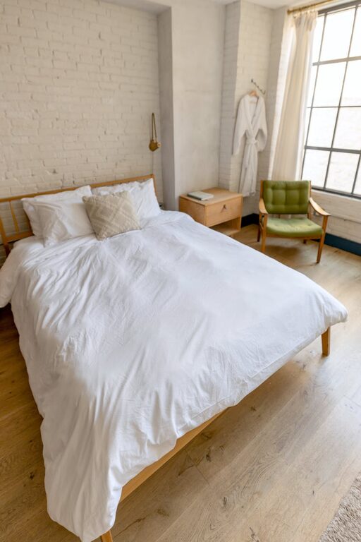
– Blues: Light sky blues or soft navy tones are linked to tranquility and openness.
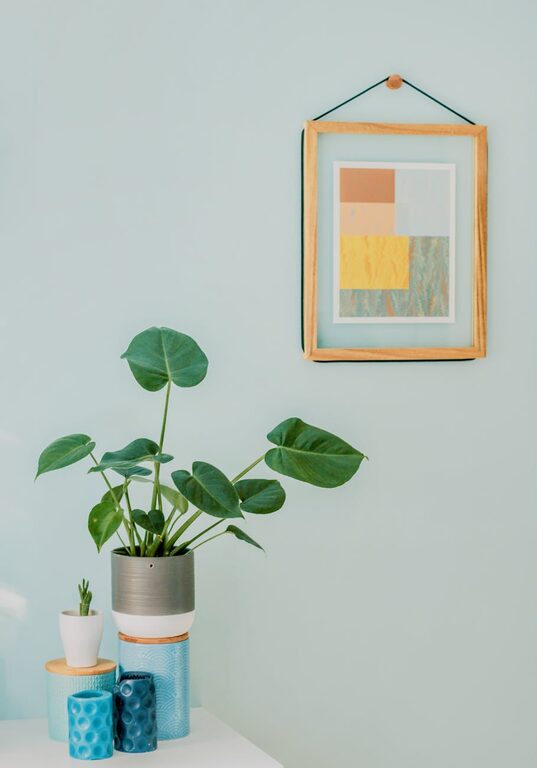
– Greens: Shades like sage, mint, or olive evoke nature and a sense of renewal.
– Neutrals: Warm beiges, soft greys, and creamy whites provide a versatile and understated backdrop.
– Lavenders and soft pinks: Gentle pastels that add warmth without overwhelming.
Tips for Choosing Calm Colors
1. Consider the Function of the Room
Start by thinking about how you use each room. Bedrooms benefit from cooler, calming blues or greens to promote restful sleep. Living rooms and dining areas can use warm neutrals with soft accents for inviting relaxation and conversation. A home office might benefit from greens or pale yellows, which encourage focus without strain.
2. Use Color Psychology
Research about color psychology can guide your choices. For example:
– Blue promotes calmness and lowers the heart rate.
– Green relates to balance and harmony.
– Neutral tones foster comfort and simplicity.
3. Observe Natural Light
Natural light changes the way colors appear. Rooms with lots of sunlight make cool shades feel fresh and airy. In darker rooms, choose warmer variants of your chosen calm color to keep spaces cozy without feeling dull.
4. Test Samples First
Always paint sample swatches on your walls. Look at them during different times of day to understand how light affects the color. Sometimes a color that looks calming in the store can feel cold or too dark in your home.
5. Limit the Palette
Using too many colors can create visual clutter. Choose two or three calm tones that complement each other and repeat them throughout your space. This creates harmony and balance.
6. Pair Colors with Natural Materials
Combining calm colors with natural elements like wood, stone, or linen adds texture and depth. For example, a sage green wall with wooden furniture enhances the feeling of being connected to nature, boosting calmness.
7. Incorporate Soft Accents
If painting entire walls feels overwhelming, start with smaller accents such as throw pillows, rugs, curtains, or decorative items in calming colors. This approach lets you experiment while giving you the flexibility to change colors seasonally.
Popular Calm Color Combinations
Here are some tried-and-true calming combinations to inspire you:
– Soft blue and creamy white: classic, clean, and peaceful.
– Sage green and natural wood: grounded, fresh, and natural.
– Light greige (grey-beige) and blush pink: warm yet subtle.
– Lavender and soft grey: delicate and balanced.
Final Thoughts
Choosing calm colors for your home doesn’t have to be complicated. By considering the purpose of each room, natural lighting, and your personal preferences, you can create a soothing environment tailored to your lifestyle. Remember to test colors first and maintain a simple palette for the best results. With these tips, you’ll enjoy a home that feels restful and inviting every day.
—
Transform your space with calm colors and enjoy a peaceful place to relax and recharge. Happy decorating!